World Population by Time Zone

Cory Doctorow, scifi author and BoingBoing co-founder, once wrote a scifi novel called Eastern Standard Tribe (available free). It was fun read but what I enjoyed most was his idea that people would belong to a "tribe" based on their time zone. In Doctorow's world, your loyalties lie not with the country of your birth but with the people who are up when you are.

This evening I was thinking about this novel and idly wondered which tribe would be the biggest? In other words, which time zone is the most highly populated?

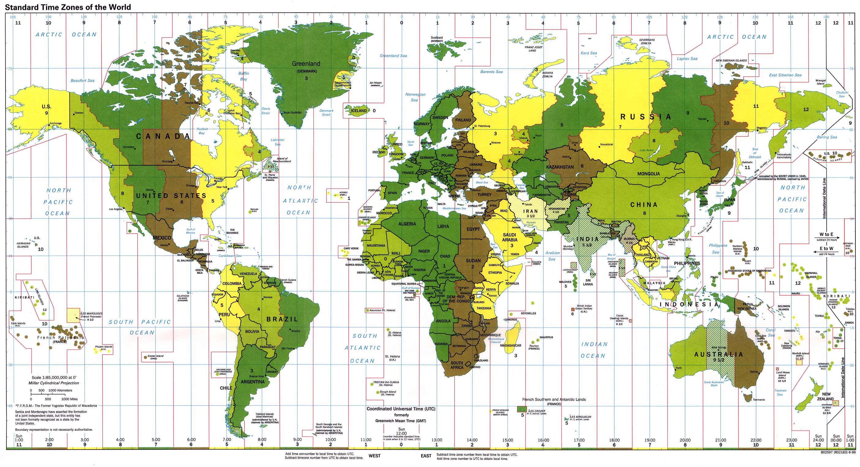
Looking at a map, the answer was obvious: it had to be UTC+8 which includes not only China but Malaysia, the Philippines, and more.

Still, the fun of such a frivolous question is less in the answer than in the answering, so I fired up Mathematica and a few calculations later generated this graph.

I cheated a little by using a simplifying assumption: if a country has multiple time zones, I divide its population evenly between them. This inaccuracy doesn't change the fact that our top three are... <drumroll>
  1. UTC+8: China and others
  2. UTC+5.5: India and others
  3. UTC+1: Western Europe and a good chunk of Africa

According to Mathematica, there are 39 different time zones ranging from UTC-11.5 to UTC+14. I wonder if anyone has visited them all? Now that would be a glorious adventure! :-)

Visualizing One Hundred Years of Pacific Rim Earthquakes

Whenever I hear of a major earthquake, I always wonder when our turn will come. I've been asking myself that question way too frequently recently. My family and I live in the San Francisco Bay Area, prime earthquake country (or so I thought until I looked at Japan...). I started playing with NOAA's earthquake data after the New Zealand earthquake. After the recent Japan quake, I thought I'd publish a few graphics. 

Disclaimer: I'm no geologist, statistician, or expert on earthquakes. I don't even play one on TV. I don't think anyone can predict earthquakes with any certainty (though there is some interesting research) and I certainly won't try.

The Ring of Fire is the name given to the chain of mountains, volcanoes, and faults that ring the Pacific Ocean. Of the world's 16 largest earthquakes since 1900, 15 occurred in the Ring of Fire.

Here's an interesting graphic showing the earthquakes above 6.0 magnitude that have hit the Ring of Fire region since 1900. Earthquakes of magnitudes between 6 and 7 are in green, between 7 and 8 in blue, and 8 or higher in red.

Notice anything? Well, as a Californian, the first thing that struck me was: "we're getting off lightly!".

This movie gives you a different way to see the earthquakes. Same legend as before: magnitude 6+ green, 7+ blue, 8+ red. The video isn't the most exciting one you'll ever see. It helps to pick a point of interest on the map and imagine some elevator music in the background :-)

Let's dig deeper...

Japan, California, New Zealand, and Chile

Looking at the graph above it's clear California gets fewer earthquakes than many other parts of the Ring.

When I compare a circular area 2,000km around the center of Japan with the same size area around California (centered on San Francisco), Japan has been hit four times as often by large (i.e. 6+ magnitude) earthquakes than California (~200 vs. ~50).

Here are Japan's large earthquakes, with 6.x, 7.x, and 8+ magnitude earthquakes broken out (notice that the data for 6.x earthquakes in 1900-1950 is likely incomplete):

The equivalent map for the 2,000 km surrounding San Francisco looks like this (sorry, no, there are no 8+ earthquakes, NOAA has the 1906 one at 7.9):

Let's look at the "earthquake history" in the other recent hotspots: New Zealand and Chile.

Earthquakes from 1900-2011 in a 2,000km area centered on Christchurch, New Zealand.

And finally South America. 2,000km area centered on Santiago, Chile. (That 9.5'er in 1960 was a monster). 

BTW, I've only focused on a few of the Ring of Fire hotspots. Indonesia, Central America, etc. are all very active.

So are we Californians due for an earthquake?

As I wrote earlier: Who really knows? On the one hand 110 years of data tells us that our corner of the Ring of Fire experiences 25% as many earthquakes as Japan. On the other hand... It may be about time for a big one to hit us.

Simon Winchester (an author whose many books I'd recommend, esp. The Man Who Loved Chinawrote recently:

[The Chile, New Zealand, and Japan earthquakes]  involved more or less the same family of circum-Pacific fault lines and plate boundaries—and though there is still no hard scientific evidence to explain why, there is little doubt now that earthquakes do tend to occur in clusters: a significant event on one side of a major tectonic plate is often—not invariably, but often enough to be noticeable—followed some weeks or months later by another on the plate’s far side. [...]

Now there have been catastrophic events at three corners of the Pacific Plate—one in the northwest, on Friday; one in the southwest, last month; one in the southeast, last year.

That leaves just one corner unaffected—the northeast.

Are earthquakes really clustered? I haven't analyzed the data for correlations. Just eyeballing the graphs above, there are enough earthquakes happening around the Pacific Rim that you could claim some correlation exists.

If you want my advice... Better safe than sorry: Be prepared.

Technical Info

All graphs were created with Mathematica 8, one of my favorite pieces of software. It's a tremendously powerful package and, though it does have a bit of a learning curve, the help system is excellent at giving lots of examples.

There's a lot more that could, and probably should, be done with this data: time-based analysis, looking for correlations, leveraging more of the data (e.g. tsunamis, impact of earthquakes, etc.).

The graphs above are pretty simple. Mathematica can create much more sophisticated ones. Here's 3D version of the Japan-area earthquakes.


Exploring the Science of Sounds with Wolfram|Alpha and Audacity

Saturday evening at bedtime, our 9 year old son Daniel told me: "Dad, I saw this program on TV. And it was two people talking, just like you and me. It was about sound and sound waves. I want to learn everything about sound. Will you teach me?"

Music to my ears :-)

So I pulled out two tools of choice: Wolfram|Alpha and Audacity. W|A is a computational search engine and, as my boys used to say, hecka useful (using "hecka" doesn't appear to be cool anymore BTW). Audacity is a swiss army knife audio recorder, editor, analyzer, and effects machine available for Mac, PC, and Linux.

Our "lesson" went back and forth between these two tools, with the real world intruding once in a while...

First off: What is sound? We talked about compression & expansion of air, how our ears work, and how sound does and doesn't travel through different mediums (like water & space).

Then I introduced the concept of Hertz. Here we used Audacity to generate an ever increasing tone from 1 to 300 Hz over 60 seconds. When do we start hearing sound? (On my Macbook Pro's speakers, around 100Hz).

Once Hertz were understood (and we'd talked about the cool low Hz rumbles our subwoofer generates) it was time to break out Wolfram|Alpha, which has some useful sound generation features.

We initially played a simple 440Hz tone (which is the standard tuning for guitars and probably other instruments too).

I'll spare you the lengthy and enjoyable experimentation that followed on W|A :-) We tried many things: different tonescombining tones, combining prime tones, even combining lots of tones and wondering whether a small change in one of the tones was still noticeable.

At this point I decided we needed a real time spectrum analyzer (Audacity can do the job, but it isn't real time). In the old (OK, old old :-) days I'd have used the one on my NeXTstation, very useful in tuning my guitar, but today I found AudioXplorer instead. Pity it's discontinued, but fortunately it's free, open sourced... and for OS X (I'm sure there are many equivalents on Windows).

Here's that 440Hz tone again...

With AudioXplorer in hand, we headed to the piano and "looked" at lots of different frequencies. It was fun to watch Daniel's interest as he played ascending notes and saw the sonogram showing a staircase pattern. (More experimentation ensued).

Next we were back to Audacity: recording Daniel's voice and applying many fun effects to it. Echo, tempo change, reverb, and more. 

Finally, back to Wolfram|Alpha one last time: experimenting with DTMF. I had Daniel press one of the keys on a phone, then we used W|A to reproduce it. Here's the tone for the "1" key. Unfortunately W|A sometimes introduces annoying clicks when generating the sounds, however you can use AudioXplorer instead, which gives correct output.

Once we'd understood how DTMF tones work and how to generate them, we used Audacity to generate a whole phone number and I showed Daniel the trick I'd promised him earlier: how to call someone without hitting any keys on the phone's keypad. We held the handset's microphone up to the laptop's speaker, press play, and... Magic! The call went through! 

All in all we had great fun with these tools. Daniel and I learned a lot together. What does he want to do now?

GarageBand! :-)

Refraction with Honey

Interesting "discovery" the other day. We noticed that a spoon in a jar of honey looked much bigger than expected, certainly more than water. The answer? The refractive index of honey is ~1.5 vs. ~ 1.3 for water.